Graphic Design · Brand Identity · 2025
Glenashton Pharmacy Brand Identity
A logo, sub mark, colour palette, and type system for an independent Oakville pharmacy.
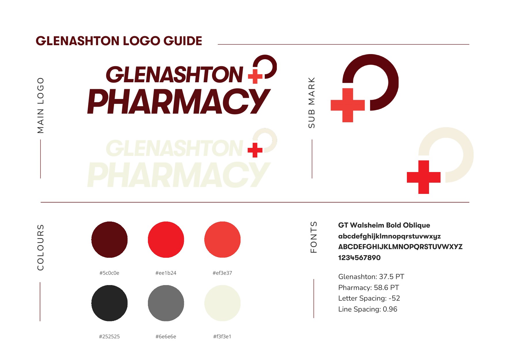
The Logo
The main logo is a stacked wordmark set in GT Walsheim Bold Oblique. "Pharmacy" is set larger than "Glenashton" so the word patients scan for carries the most weight, and the forward lean of the oblique gives a small independent pharmacy some energy that a typical upright medical logo lacks.
- Typeface
- GT Walsheim Bold Oblique
- Glenashton
- 37.5 pt
- Pharmacy
- 58.6 pt
- Letter spacing
- −52
- Line spacing
- 0.96
Tight tracking and a line spacing under 1 lock the two lines into a single compact shape, which holds up at small sizes like a website header as well as at storefront scale.
The Sub Mark
The sub mark pairs a classic pharmacy cross with an open ring, which sits in the corner of the wordmark and also works on its own as an icon. Both the logo and the sub mark come in a maroon version for light backgrounds and a cream version for dark ones, with the red cross kept in every version.
Colour
- #5C0C0E
- #EE1B24
- #EF3E37
- #252525
- #6E6E6E
- #F3F3E1
A deep maroon leads the palette, with two reds reserved for the cross and for accents, a charcoal and grey for text, and a warm cream that replaces stark white as the background.
In Use
The identity now appears on the pharmacy's storefront window and anchors the redesigned website, where the maroon, cream, and red palette carries through every page.