Graphic Design · Web Design · 2026
Glenashton Pharmacy Website Redesign
A rebuilt website for an independent Oakville pharmacy, organized around the things patients actually come to do: book, refill, and find the right service.
Problem
An aging WordPress site that scattered patients across the web
Glenashton Pharmacy has served Oakville for over 20 years, but its website hadn't kept up. Built on WordPress with a dated slider plugin, it sent patients to separate outside sites for refills and the product catalog, crammed eight items into the main menu, and gave its services no pages of their own.
Approach
New structure and design, original words
I rebuilt the site from scratch as a new Wix build while keeping the pharmacy's existing copy word for word, so the work focused purely on layout, hierarchy, and navigation. The content the owners had already written and approved stayed intact; what changed was how patients move through it.
Outcome
A live site built around patient tasks
The new site is live. Booking an appointment and requesting a refill are available from the header, the hero, and the footer, and every service now has its own page that patients can reach in one click from the main navigation.
The Old Site
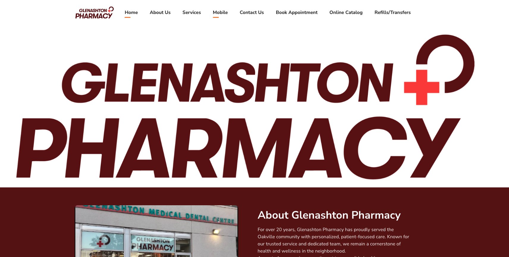
The first thing visitors saw was the logo blown up to fill the screen, so hours and the phone number sat well below the fold. Patients who wanted to do anything beyond reading had to leave the site: refills and transfers lived on a separate portal, the product catalog on another, and booking on a third. Services like travel consultations and minor ailments were just icons linking to shared spots on one long services page, so two different services often led to the same place.
Smaller problems added up too. Several service icons were cropped screenshots, the email link in the contact section didn't go anywhere, the App Store badge wasn't linked, and the page blocked pinch-to-zoom on phones, which matters for an audience that skews older.
Design Detail
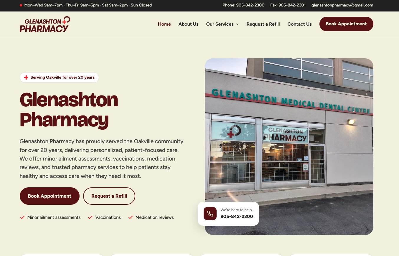
The page opens with a slim utility bar carrying hours, phone, fax, and email, because for a pharmacy those are often the only things a visitor needs. Below it, the main navigation groups all five services under a single menu and keeps the two most common actions, Book Appointment and Request a Refill, as persistent buttons.
The homepage then works as a guided path: a hero with the pharmacy's introduction and both primary actions, a row of quick links for the most common tasks, the full services grid, a team section introducing the two pharmacist co-owners, real Google reviews for social proof, and a contact block with hours and an embedded map.
The site is built on the brand identity I designed for the pharmacy: a soft cream background, maroon for headings and primary buttons, and the logo's red cross used sparingly as an accent. The storefront photo replaces the giant logo banner, so patients see the actual place they'll be walking into.